
Room to
breathe.
Soft textures. Considered shapes.
A little more space for the everyday.
not just looked at.
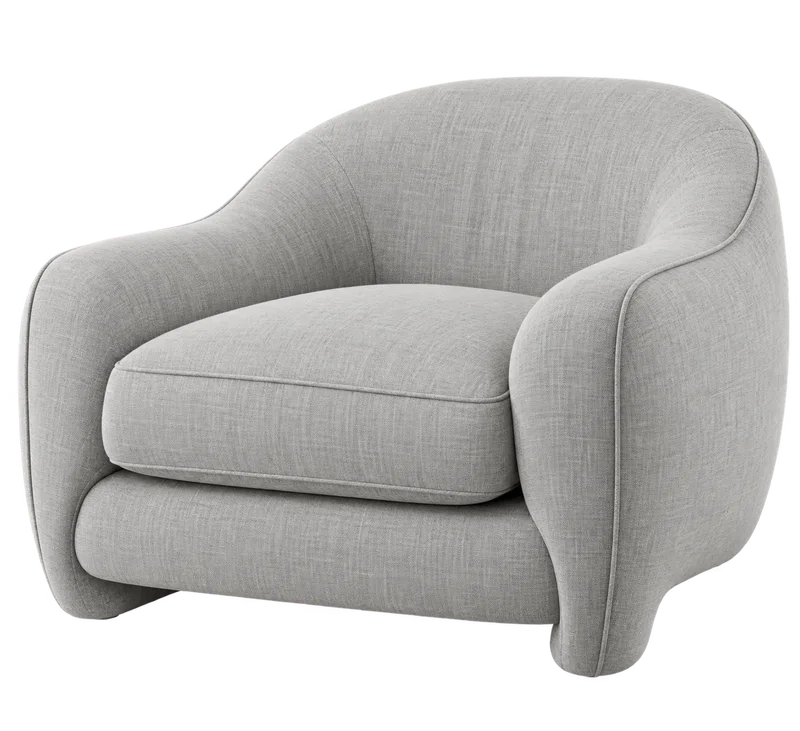
A few good pieces.
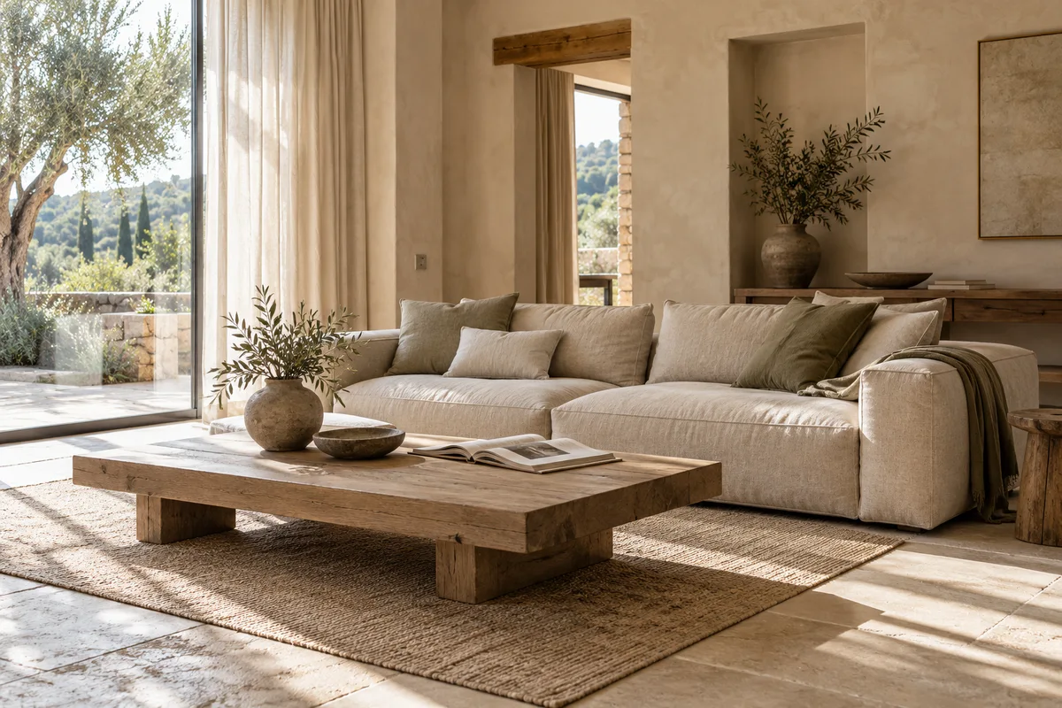
Leave room
for the little things.
The first coffee. A chapter or two.
An afternoon with nowhere to be.
Good things
take their time.
We believe a home comes together one thoughtful piece at a time. Honest materials, useful details and a shape that feels just right.
Our collection is small on purpose. Less to choose from. More to live with.
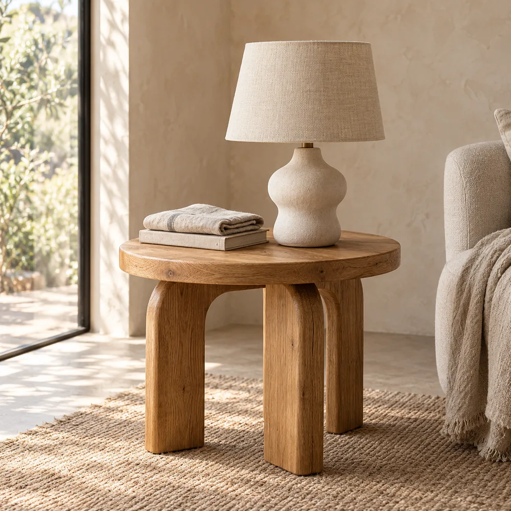
Texture makes the difference.
Woven, not flat.
A soft touch, with depth in every thread.
Nothing to hide.
Real grain. Warm tones. Natural character.
A little warmth.
Earthy accents that make a room your own.
Make yourself
at home.
Can I change the chair color?
Change Primary in the palette editor to recolor the chair in the header. The collection photographs retain their natural materials.
Can I order these pieces?
This is an interactive design preview, not a real shop. Products, prices and bag actions are examples; no orders or payments are taken.
How does the color preview work?
Buttons, surfaces and typography follow your palette. The chair photograph is tinted locally, keeping its original texture and shadows. Photographic colors are approximate.
Good morning, Maya.
Here’s what’s happening in the studio.
Team activity
Completed tasksProjects
| Project | Owner | Status | Progress |
|---|---|---|---|
| Autumn collection | MC | In progress | 68% |
| Product photography | AR | In review | 92% |
| Storefront refresh | SC | In progress | 45% |
| Packaging study | LM | Complete | 100% |
Your next steps
A home, considered.
The everyday collection
01 Project overview
A small collection of useful furniture, built around comfort, natural materials and everyday routines. The visual direction should feel quiet, welcoming and easy to live with.
Use a restrained palette to connect the collection across the website, product details and printed materials. Let the photography and the quality of each piece do the talking.
02 Design principles
- Keep it useful. Give every element a clear purpose.
- Leave room. Use generous spacing and a simple hierarchy.
- Be consistent. Carry the same colors through every touchpoint.
03 Delivery plan
| Deliverable | Owner | Timing |
|---|---|---|
| Color & material direction | Design | Week 1 |
| Product photography | Studio | Week 2 |
| Collection launch | Digital | Week 3 |
Next step: review the palette together, then apply the agreed colors to the collection.